I'm not going to bother with a lead-in this time: Office 2003, running on Windows XP (I'm assuming that it's this bad on Vista as well), is the worst dogs-breakfast example I know of, of the fact that if you don't give people consistent and clear guidelines, you end up with a midden-heap of conflicting ideas.
Let's have a breakdown look at how each individual component - Word, Access, Excel, Outlook (I can't be bothered opening up PowerPoint to compare) - handles multiple documents:
Word: Each document has its own window, and own icon on the task-bar.
Outlook: Each application (mail, calendar, tasks, address book) has to be jiggled around in the same window, although you can open them in a separate window, when they each get their own task-bar icon.
Access: Each database looks as though it exists in its own window, but actually each open form/query/table whatever gets its own task-bar icon and, when you have multiple databases open (pity me, people), they aren't in any order so if you're in a hurry you are faced with trying to work out which one you want. This alone is stupid.
Excel: Each open spreadsheet uses the same window. You get one task-bar icon, you get one entry in the alt-tab switcher, you get a confusing mess. No quick switching from one to another if you want to compare, or carry over TOIL between timesheets, or whatever. Unexpected, and infuriating. Just to add insult to injury, Excel appears to be the only application that doesn't respect printer default settings. I shit yet not.
Who's responsible for this? And how can we enact revenge?
Friday, 25 January 2008
Tuesday, 22 January 2008
Life imitates tacky art
There is a common theme in the more pulpy forms of science fiction (and the occasional better stuff) of astronauts landing on an alien world, wondering where the animals are, and then getting eaten by the plants. There is a side option here of busty female astronauts having their clothes ripped off first, a popular one for the more garish forms of tacky comic.
Now, we all know about animal-eating plants like pitcher plants that drown small insects and the occasional lizard, and venus fly traps that actually move (cue the fevered visions of pulp illustrators who dream up giant venus fly traps!)
Now (drum roll please) the plant world is fighting back against these messy, grazing animals and have a pitcher plant big enough to eat rats! I wonder if Ming the Merciless ever had one as a pet?
Monday, 21 January 2008
Unfunny headlines you have to laugh at anyway.
"Woman on trial for sexually assaulting soldier" (ABC News Online)
Isn't it normally the other way around?
Isn't it normally the other way around?
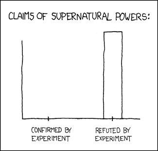
Healing energy, eh? Let's review the data.
User see, user click
Message to all website developers: People are trained, by a long indoctrination on Windows, Macs old or new, Amiga, BeOS, OS/2, Solaris, Irix and numerous *nix interfaces, to click on icons. Pretty pictures are buttons, and buttons do something when you hit them.
So when you are designing your website, it's okay to do this:
"Label: URL"
It's okay to do this:
"Link that describes itself"
It is not okay to put in an icon and then not make it part of the link. If you have a pretty picture, users will expect it to do something. Vodafone are hideously guilty of this, and they have no excuse for not knowing better. InfoXchange Australia are guilty of this (and sparked off this outlet for simmering resentment) and perhaps could be excused, being a welfare organisation, except that they're an Internet clearing house of information, and really should be hiring website designers who know better.
Cue Graham Garden voice: "Get it right!"
Subscribe to:
Posts (Atom)
